CAPITAL ONE · AUTHENTICATION
Making Complex Authentication Feel Invisible
THE CHALLENGE
Capital One needed a visual system for AirKey that would work across 75 million active cards. The authentication flow had to feel seamless while meeting strict security requirements. Every animation needed to load fast, render consistently across devices, and communicate clearly without text.
THE APPROACH
I designed 7 core animations in After Effects and optimized them as Lottie files for web deployment. Each animation runs 4–6 seconds in a seamless loop, covering the full authentication flow from card tap to confirmation.
The illustration and animation process was never separate. From the first line I drew, I was already thinking about what would move, in what order, and at what depth. That mental model determines how you build the illustration: which elements sit on top, which sit below, how layers are organized. If you illustrate without thinking about motion, you end up rebuilding everything when animation starts.
Each animation went through multiple rounds of refinement to hit three targets: file size under 100KB, render time under 400ms, and zero dependency on external assets.
THE BRIEF
A couple of words, and stakeholders who took weeks to align internally. So I designed four completely different directions on purpose, giving them something concrete to react to. It's easier for a group of executives to say "that one, not that one" than to describe what they want from scratch.
EARLY EXPLORATION
The only instruction: explore how a user authenticates on mobile. No style, no gesture, no direction. These sketches were the process of testing the problem before locking the answer.


DIRECTION APPROVED
Out of four directions, two things carried forward: the human gesture of hands, and the isometric style. What you see here is that direction refined with shadow and detail, still without color. Structure gets validated before a single hex code is chosen.

COLOR: MODERN & FRESH
Once the direction was locked in grayscale, the first color request came in: something modern and fresh. Green and blue on the same isometric structure. I also added a black stroke, a detail nobody asked for but that fit the direction I was testing. Green and blue was the client's first ask, and I delivered it. But in context, it felt closer to a fintech startup than a bank. It was the first real test of color on a system that had only existed in black and white, and it told us clearly what we didn't want.

STRONG IDEAS, CLIENT-LED DETOUR
After the green and blue pass, the client asked to explore purple. So I did. Two stakeholders on the client side had different priorities: one wanted to emphasize the authentication moment, the other the card tap. My job was to listen to both and build out complete versions of each direction, so as a group we could compare finished proposals and decide which one communicated best. That decision was going to affect 75 million cards. It needed to be made looking at real work, not at descriptions.
I also pushed further on my own inside that round: suggesting characters to carry emotional weight, not security as a checkpoint, but the confidence of having a major bank behind you. These characters didn't ship exactly as shown here, but the idea got approved, adapted into a more relaxed context.


THE PALETTE CORRECTION
Purple didn't land emotionally on the final review. It felt closer to a wellness brand than a bank. So I proposed a third pass on my own: teal and navy, closer to Capital One's own blue. That's what shipped. The chip lifting off the card became the last piece. It's not just a nice detail — it's where the name AirKey actually comes from.

DELIVERED
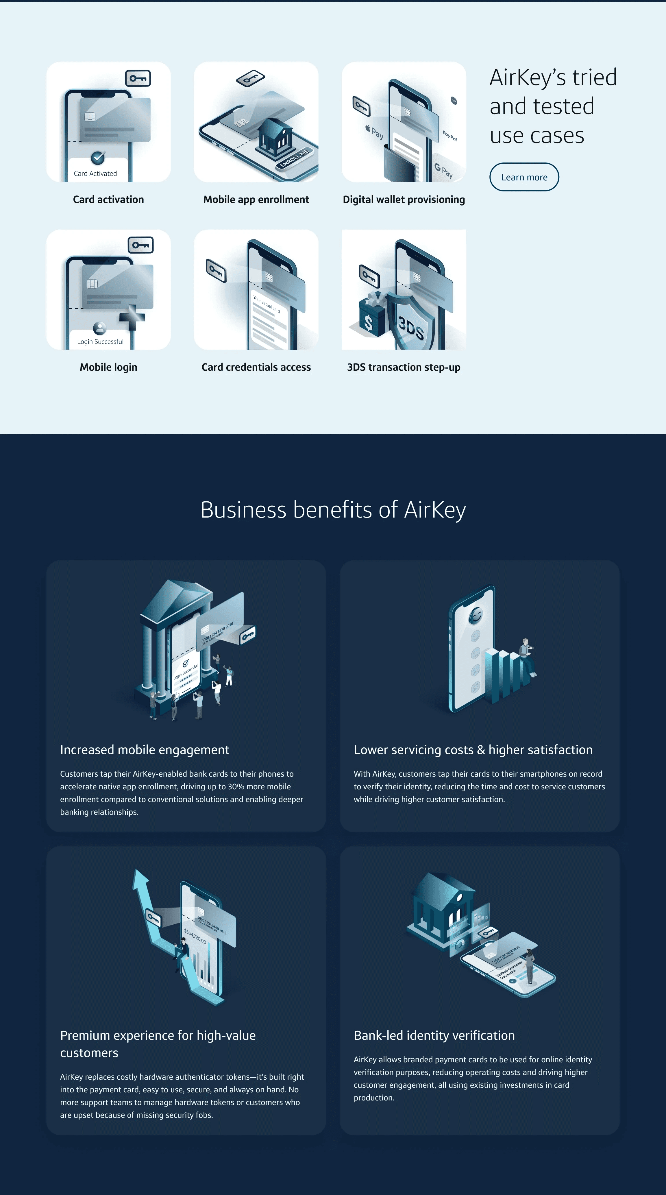
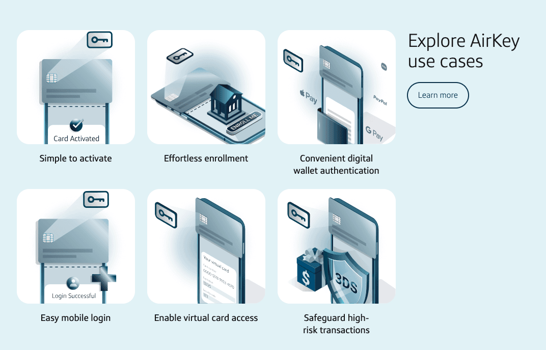
A system of 12 illustrations and 7 Lottie animations. Shown here: 6 animations covering the core authentication flows, and 4 static illustrations communicating business value to stakeholders.
BUSINESS VALUE
Four outcomes that made the business case for authentication.
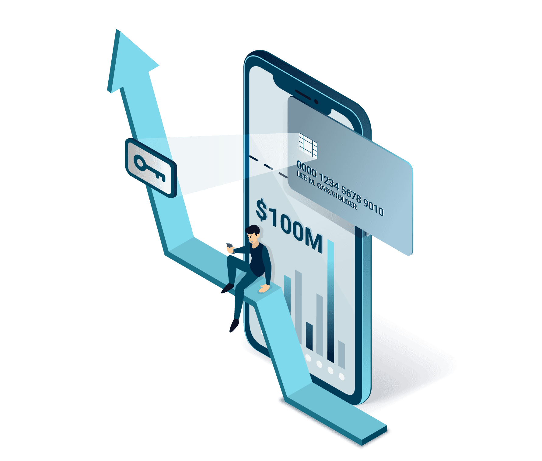
Increased Mobile Engagement
Customers tap AirKey-enabled cards to accelerate native app enrollment, driving up to 30% more mobile enrollment
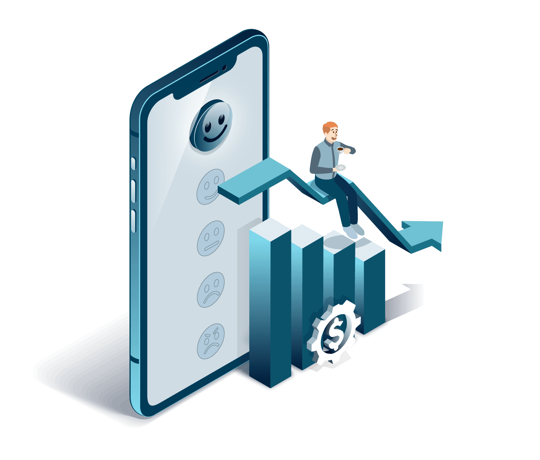
Lower Servicing Costs & Higher Satisfaction
Customers tap their cards to verify identity, reducing servicing time and cost while driving higher satisfaction.
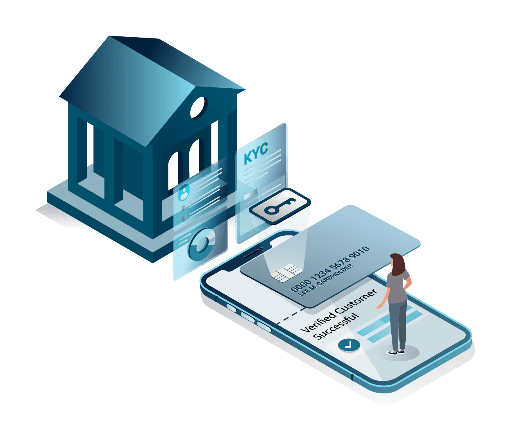
Bank-Led Identity Verification
Branded payment cards used for online identity verification, reducing operating costs using existing card production investments.
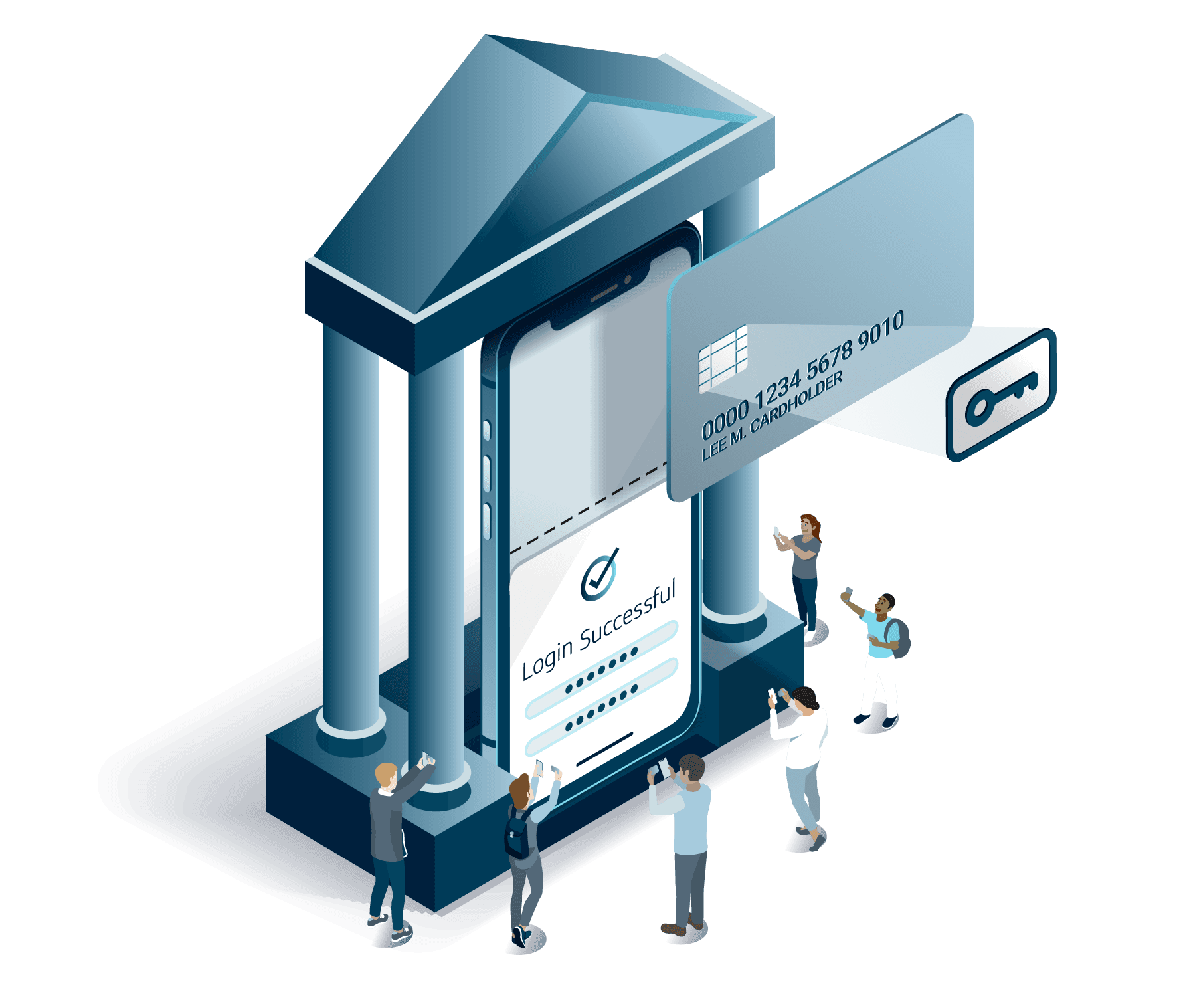
Premium Experience for High-Value Customers
AirKey replaces costly hardware authenticator tokens — built into the payment card, easy to use, always on hand.
CONTEXT
The animations and illustrations as they appear on airkey.com, embedded in the product, not shown in isolation.
IMPACT
Cards in market
Illustrations
Lottie animations
Jorge is 10/10 the best teammate you could ask for. His creativity and breadth of experience shine through when given seemingly impossible tasks from seemingly impossible people.
— Dustin Cogswell,
PRODUCT & QA, KUNAI
> LIVE_PRODUCT
This authentication system is currently active on 75,000,000+ Capital One cards.
REFLECTION
The style didn't arrive fully formed. We explored flat, linear, and 3D before landing on isometric. The card tapping the device went through 3-4 rounds of revision on its own, then multiple rounds focused only on color and style.
That's before a single frame was animated.
What that process produced was a visual language with a clear foundation: hands, card, device, bright colors on an isometric grid. Every subsequent illustration was built on that foundation. When you define the rules that carefully upfront, the system scales without losing coherence.
The goal was never to make authentication look impressive. It was to make the phone feel like an extension of the bank, familiar and trustworthy, not a security checkpoint.